Commercial Art

My first task of the day is to make a Mind map of all the commercial arts available.

Visual example for each commercial types, I’ll be starting with Video and Performance.

Half of this type of commercial is on the internet. So thats social media and the TV. each person watched one or the other. About 90% are social media so more is directed towards slight advertisements based on your search history and will aim videos or even simple picture advertisements towards you. One of the best examples of this is Instagram. every so often you get an ad directed to something you like and the people you follow. For an example I got this video AD today.

This is one AD I’ve had from Samsung. The whole advert is very loose, and free spirited and is something to grab the attention of anyone.

Next is Entertainment

Entertainment advertisement is like the media one. you’ll be seeing it on social media as well as the TV. performance is more for the TV. Perfume adverts have elements of acting to them and causes senses of tension and build up. A very easy target of this are old lynx adverts.

This is one of the many Lynx adverts that caused a under a minute of entertainment thats showing us a basic body wash and body spray. Girl Broken Down Lynx Rise Wake Up Calls-Funny Commercials – Bing video

next is Visual Communication.

The strongest example is the ‘We can do it!’ Now in the 20th century we have ‘Just do it!’ Its not as flashy as the ‘we can do it!’, the art represents the struggles of women in the war, so instead of feeling worthless they got to work and made women powerful with this one piece of art and the slogan. Where as now its honestly really bland and basic, no 𝒻𝓁𝒶𝓋𝑜𝓊𝓇.

Fashion

This is one of the most easiest form of advertisement to get people to but more of the product while wearing it. Something that’s flashy WILL sell. Back in 2015-16 the THRASHER jumper, hoodie, and shirt was all people wore, not any people knew who they were they just wore it because it looked good, That’s what got people interested in the brand and looked more into it. Its very recognisable with the flames and simple design.

This magazine company set a brand out without people knowing it, this is yet again a very good way of sneaking anything into clothing. just make sure it looks good and fits the youth of today.

See the source image

Environmental

This is something we all most likely see at a shopping canter in any shop. a display of some sort with clothing and or items. This isn’t just in stores, you can easily cut a bush into something such as a globe if you’re talented enough perhaps even make it the planet. simply taking a picture of any global disaster is something for people to want to go look at and see for themselves.

See the source image

Packaging

This is yet again an easy way to advertise. McDonalds, Monster energy, Heinz- ANYTHING with a packet is targeted for an advert. Food is an easy target, people litter and most would rather have their brand slapped across the package for people to see when they walk past or even pick it up to throw away. Its just sad that some people need to put advertising on things that are so easily thrown onto the ground. paper cups and any type of food packaging, more McDonalds than anything.

See the source image

Ornamental

This is a little harder for me to get as I don’t really see an ornament and think what brand is that its just, that’s cute where can i get it. Its mostly what shop instead of what brand the actual ornament is. If anything, it would have to be a frame that recognisable, most vintage ornaments aren’t recognisable, but expensive branded ones are. you have to literally set your brands name on it so you know what it is and where its from. This is a risky was to advertise but can pull off. And yes, this is a real ornament.

See the source image

Product

These are very useful. We all see reusable bags, when we go shopping its either a bag for life or a branded big bad from any store with their name on. so if you think ‘i need a big bag to carry shopping in’ you look at someone else’s and know where to go and grab it from. Its always in a place to notice at the Till, if not asking an employee is very simple.

See the source image

Decorative

Decorations have the same effect as the Ornamentals. You wont know unless its a particular style, its not like people will be dropping their decorations in the street, the only other way to get the brand across is to invite people into your house or take pictures and upload them to social media.

See the source image

Publishing

This meets the sneaky advertising to sell. Say if an artist releases a single, youre going to go by off their brand and name. You look for a theme, something that seems like them, making sure its flashy or more toned down. This all really depends if the cover is something worth looking out for. This works for movies and book covers, you wont want to be interested if you only saw the words, you’d want to visualise what it’ll be about, The whole colour pallet is to do with whatever will be inside.

See the source image

Branding

The easiest type of advertising is making something yours, adding an interesting flare to it, catching to the eye and something that’ll make people look and think ‘I recognise that’. just the design wont take you all the way, you need to have your own colour pallet and a theme in mind to match your brand, having mixed signals through the branding and actual product is very annoying for potential buyers.

See the source image

Advertising

Now, advertising advertising can be something a little tricky, you actually need to be interested in it to want to search for it. Any Painting•Illustration•Photography•Videography•Guerilla.

Commercial Art

It can be created within theboundaries of marketablepossibilities.•Or, it can becreated as a fine piecefirst and thenapplied to aproduct.​•It has some ormanyfunctionalrequirements​•It can follow an art movement.

Fine Art

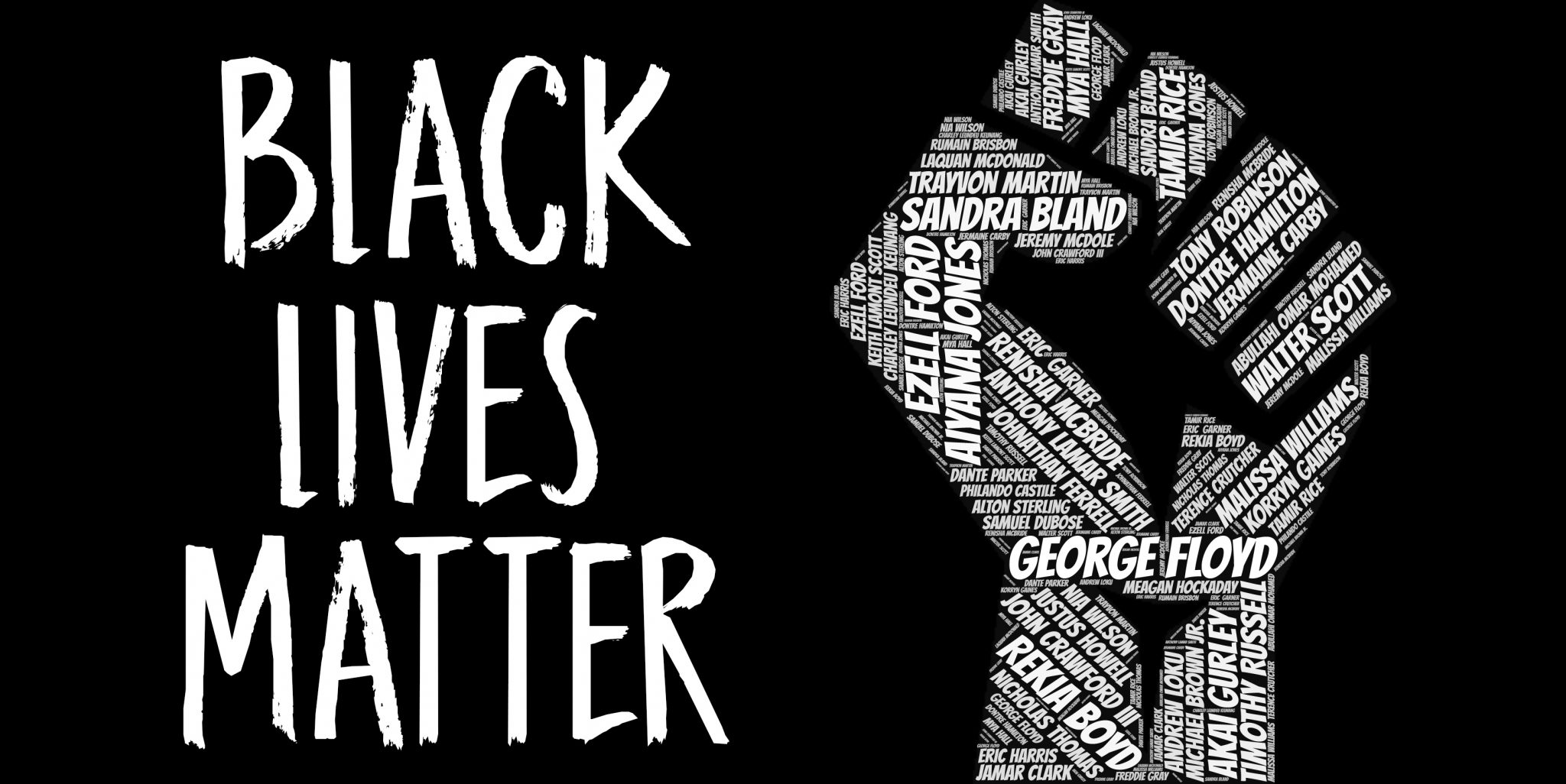
This can be used to motivate people, just like how the BLM movement with creating art pieces of all the people who died, this inspired people to get along with the movement, not to buy a product but to help a cause.

See the source image

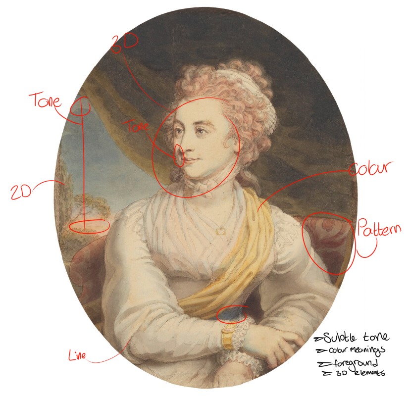
Our final task was to draw a portrait without taking our pen off the paper, this was hard as im so used to taking small sketching movements, I like how un natural this looks and how off putting it is in a way.

10 Artists

Death of Socrates​

The Death of Socrates – Artist: Jacques-Louis David – Dimensions: 1.3m x 1.96m​

Location: The Metropolitan of Art – period: Neoclassicism – Created: 1777-1787 – Subject: Socrates – Medium: oil on canvas​

Although he consulted Father Adry, a scholar on the subject, David’s depiction of Socrates death contains many historical inaccuracies. He removed many characters originally described in the dialogues of Plato. However, he included Apollodorus, the man leaning against the wall just within the arch, even though he is said to have been sent away by Socrates for displaying too much grief. David also historically misrepresented the ages of many of the pupils of Socrates, including Plato. Plato would have been a young man at the time of Socrates’s death, but in this painting he is the old man sitting at the foot of the bed. Even the face of Socrates is much more idealized than the classical bust that is typically used as a reference portrait of Socrates.[1] This underlines that Socrates life is projected out of Plato’s mind, whereas the old Plato idealises Socrates. Thus, the painting can rather be seen as an analysis than a failed historic depiction.​Source: https://en.wikipedia.org/wiki/The_Death_of_Socrates​Yes that was from Wikipedia but this was the only source I could find of Davids painting had some sort of viewpoint on how he personally saw socerates death.​His references Bordes, Philippe. “David: Paris and Versailles.” The Burlington Magazine’ 132, no. 1043 (Feb. 1990): 154–156.​De Caso, Jacques. “Jacques-Louis David and the Style ‘All’ antica’.” The Burlington Magazine 114, no. 835(Oct.1972):686-690.​De Nanteuil, Luc. Jacques-Louis David. New York: Harry N. Abrams, Inc., 1990.​Lajer-Burcharth, Ewa. Necklines: The Art of Jacques-Louis David after the Terror. New Haven: Yale, 1999.​Maleuvre, Didier. “David Painting Death.” Diacritics’ 30, no. 3 (Fall 200): 1–27.​Plato, Eva T. H. Brann, Peter Kalkavage, Eric Salem . Phaedo. Focus Publishing/R. Pullins: Bloomington,1998.​Vidal, Mary. “David among the Moderns: Art, Science, and the Lavoisiers.” Journal of the History of Ideas56, no. 4 (Oct. 1995):595–623.​

A few years ahead of the French Revolution, The Death of Socrates was commissioned by the Trudaine de Montigny brothers, two radical political reformers who were calling for an upheaval of French norms by promoting a free market system. To them, Socrates was a hero who sacrificed himself to his principles rather than accepting banishment and shame. In this painting of stoicism in the face of death, David was creating a clarion call for how the rebels should push toward their goals, not with cowardice and outcry like Socrates’s students—save for Plato and Crito!—but with self-control, honor, and fearlessness. ​

In 1784, David debuted Oath of Horatii, which depicted a Roman legend with vibrant colors of crimson and blue.This palette was panned by critics, who called it “garish.” As such, art historians suspect that David chose to subdue his reds in this piece. Notably, the colors grow more vibrant toward the center of the painting, thus drawing our eyes to Socrates and the young man holding the cup of poison. Source: https://www.mentalfloss.com/article/501955/15-things-you-should-know-about-jacques-louis-davids-death-socrates

To me the message was clear that something was going on. Without knowing who the man actuially was, it had to of been some tragedy.​

Untitled wall around Donald Trump’s Walk of Fame star

This wall, conceptualized and constructed by the artist known as Plastic Jesus, was placed around the Hollywood Walk of Fame Star of Donald Trump on July 20, 2016 — the same day Trump was officially nominated as the Republican Party’s presidential nominee. ​
Complete with barbed wired and tiny “Keep Out” signs, the work played of Trump’s controversial statements about building a wall on the southern border of the U.S. as part of a plan for immigration reform. The artist, known for progressive messages on social inequality, used the work to oppose Trump’s comments.​
“Personally, I’ve got nothing against Donald Trump,” Plastic Jesus told The Huffington Post. “I have everything against his policies and the culture he’s trying to create in America.” ​
Source: https://mashable.com/2016/09/24/public-art-social-good/?europe=true
A message that he wanted to portray ended up around his star as a piece of art protesting the idea in a peaceful way, almost saying that if you do this, this is what will become of a reputation for you.​

A Tale Of Two Hoodies (racism)

George Zimmerman​
40″ x 30″ | oil on canvas​
​KKK hood. The KKK has a long history of violence, is the most infamous – and oldest – of American hate groups .  Unlike the flag—which lurks beneath the surface of the other flag, the KKK hood conceals the identity of the police officer’s face, suggesting that police openly practice racism. The issue of racial profiling didn’t happen overnight; rather comes from centuries of systemic racism. D’Antuono exposes this complex history with two key symbols of racism in America:  the Confederate flag and a Ku Klux Klan (KKK) hood.​
The response is every bit as important and as the art,” confesses D’Anuono . The paintings are always created with the public in mind, as he attempts to ruthlessly put the issue in blank terms right in front of the audience so that they may not continue to ignore it but become conscious of the problem as well as inspired to make changes in the system. A Tale of Two Hoodies presents the issue many African American men face — being labeled as suspicious for nothing more than the color of their skin. After 230 years of American history, the American Public seems to have formed a profile of what danger looks like, regardless of the actual actions of the man; he is declared guilty by his physical appearance. He creates controversial art intending to spark emotion and provoke public discourse. During the last decade, a number of D’Antuono’s works have garnered significant public attention:  The Truth, which features the crucifixion of president Barack Obama;  Don’t Ask, Don’t Tell, which alludes to the issue of pedophilia in the Catholic church; and most recently, A Tale of Two Hoodies, which references the tragic death of Trayvon Martin, an African American boy who was shot and killed by George Zimmerman, who justified his violent act under the Florida Stand Your Ground law. Created in the wake of this violence, D’Antuono’s painting addresses national and historic issues of race relations in America. A Tale of Two Hoodies symbolizes the travesty of racially profiling innocent children and the effect of racism in law enforcement and the judicial system.​
All od this information can be found here: http://artperspectives.web.unc.edu/controversy/two-hoodies/two-hoodies-essay/
In my eyes its how that the cops in america- the older ones, have different beliefs, its to believe that half od the USA uniformed are part of the KKK or even white supremasists. In more times that theres a death because of an officer its 9 times out of 10 a person of color. This happens to caucasion people just not on the same level as people of colour.  The recent BLM protest can hold accountable for that. More black men and women died standing for whats right, Just as many as caucasion men and woman.​
I believe that Georges aim was to make a very clear piece about racism. The officer is a caucasion, seeming to be old cop. And the little boy is black and innocently handing him a share packet of sweets. Offering piece even though you have a gun to youre head the whole time, As a “watch your head” stance.​

Pietà

“Pieta” by @tylonn.j.sawyer Studio Noize Episode 70 with artist Tylonn Sawyer. He’s a phenomenal painter and we talk about his American Gods series which explore how patriotism and blackness work together.​
American Gods: N/A (2018) is a mediation which examines the fallibility of Americana by placing blacks at the forefront of its narrative. Between three acts a mother mourns holding her fallen son evoking Michaelangelo’s Pietà, a diva sings a requiem (Lift Every Voice and Sing- The Black National Anthem) for America to an empty church and a group of five artists/activist dressed in all black dawn the masks of their philosophical counterparts. Using the American flag to tie these scenes together, American Gods: N/A addresses issues of gun violence against black males, the separation of church and state or the state as church and historical/contemporary black activism Written and conceived by TYLONN J. SAWYER FILMED BY JAMIN TOWNSELY VOCALS BY LASHAUN PHOENIX MOORE SCHEHERAZADE WASHINGTON PARRISH EVAN PARRISH TAWANA PETTY JOEL “FLUENT” GREENE SYDNEY G. JAMES NANDI COMER​
Source: https://gramho.com/media/2316228512011225760 ​
Pietà 72” x 48” Oil on canvas 2018 ​
Brief artist description: Tylonn Sawyer: From racism, from police brutality, the intersection of history, and the absurdity of pop culture. I like my work to have a certain degree of visual poetry to it, rather than just objectively being what it is that you see in front of you. And so, when I look at something like the pieta — if you think about Michelangelo’s Pieta — that is still a very poignant sort of subject matter to have. A mother mourning the death of her son, or child in general. It is something that is visceral, and no matter what language you speak, it’s something that I think anybody seeing that image would understand.​

Here to stay,​
“Illustrations to dismantle patriarchal nonsense and systemic racism.”​

#DefendDACA piece commissioned by California Endowment.​
Lukashevsky works in a pastel palette, framing the characters in her illustrations against a variety of pink and blue backgrounds.​
My hope is that people take the illustrations to heart and follow the instructions on how to take action when I provide them.​
Source: https://www.designsponge.com/2017/11/combining-art-social-justice-ashley-lukashevsky.html
Ive had a look at her pieces and I really like them. They all convey a message, and helps people embrace their self.​
The lines are all thick and very curved, it seems to not be too controlled rather it seems very loose and fluid. She knows where shes going when drawing, theres almost like theres a idea in her head already and she just needs to put the brush down and it all flows out. Theres no need to always talk, the actions of her art speaks louder than anything.​
What connects all of these images is that rather than showing people facing oppression, they highlight people coming together. The illustrations, like Lukashevsky, are optimistic: “It gives me more hope to be able to draw what I want the future to look like instead of reinstating the harm and pain that is existing right now. I really rely on hope a lot because of the situation that we’re in with all of these cis-, hetero-, patriarchal, capitalist bullshit systems.”​
Source: https://www.thecut.com/2020/01/ashley-lukashevsky-drawing-a-better-world.html

Image by Australian street artist “Meek”,​
stencil art of his “Begging for Change”

Australia 1978 ​
stencil​
Signed dated and inscribed, lower right below image, in black ink ‘Meek ’04 A.P.’​
printed image 89.1 (h) x 73.5 (w) cm​
Gordon Darling Australia Pacific Print Fund 2007​
National Gallery of Australia, Canberra​
Street artist Meek (an ironic name which draws attention to the usual boastfulness of street artists) sprayed Begging for change on a railway station wall in Melbourne. The 2004 record of this stencil in the Gallery’s collection features a life-size man, sitting dejectedly at ground level, holding a sign that reads, “Keep your coins, I want change”. By displaying this work on a railway station wall Meek was able to engage a public, who, in their daily commute, pass by homeless and symbolically disenfranchised people every day. The text on the homeless man’s sign, however, suggests a more altruistic plight than the individual homeless. Witty and irreverent, this work visually composes a strong social comment about money and its inability to solve all problems. It also expresses the concerns of many street artists regarding the lack of good political leadership in Australia during the early 2000s, a period considered to be the zenith of stencil art production in Melbourne. Through this work Meek also demonstrates the power of text, essential to poster-based design but also prevalently used by fine-art-school trained artists and graphic designers.​
Source: https://nga.gov.au/exhibition/spaceinvaders/default.cfm?IRN=162193&MnuID=3&ViewID=2
This is a piece that screams out above all the others. Change is more needed than money in people’s mind. As time has gone on there’s a higher demand for money in the world, no one wants to share their hard-earned cash and there for, become selfish. This all leads up no not caring and not worrying about the world now. That can be how the attitude of people are, company’s as well as the earths health, its dropping significantly each passing year.

FREEDOM TO LEAD​

Shepard Fairey openly expresses his opinion on areas such as women’s rights and women in leadership roles, women’s sexuality and sexism, feminism, racial inequality, government influence and power in the United States and the importance of US citizens to speak up against the dominant groups and ideologies that oppress several members of our society. As Fairey stated when discussing the motivation for his artwork, “the real message behind most of my work is ‘question everything.'” Fairey is always created images that cause viewers to really stop and think about the issues that go on in society that go unchallenged. Fairey has also recently created a short film, “Obey This Film,” that goes into his career, how he got started and the meaning behind his artwork. Freedom to Lead – Daw Aung San Suu Kyi – Shepard Fairey Obey Contemporary Print 2009.Height: 24 in. (60.96 cm)Width: 18 in. (45.72 cm). They printed posters to raise funds and awareness about the situation in Burma. You can support by buying a poster from them or making a donation.​
Source: https://www.1stdibs.co.uk/art/prints-works-on-paper/shepard-fairey-freedom-to-lead-daw-aung-san-suu-kyi-shepard-fairey-obey-contemporary-print/id-a_5589792/
Source: https://artsforsocialjustice.weebly.com/shepard-fairey.html
Both founders were deeply involved in the 2007 Saffron Revolution and continue their struggle for peace, freedom and democracy with the Peace Campaign through peace walks around the world and through the distribution of peace stickers and T-shirts.​
Additional projects of The Best Friend include operating two schools for Burmese migrants in Thailand, plus a Relocation Center for Burmese refugees currently living on the rubbish dump of Mae Sot.​
http://www.thebestfriend.org/2010/07/05/relocation-peace/

Ester Hernandez, “Sun Mad,” 1982​

A first-generation Chicana, Ester Hernandez is a key figure in the Chicano civil rights art movement that emerged in America in the late 1960s. Her most famous image, the screenprinted poster Sun Mad, was first created in 1981 and expresses her anger at the human and environmental cost of pesticide use in commercial grape growing in California. A second edition of the screenprint, printed in 1982, has recently been acquired by the Victoria and Albert Museum and will feature in the forthcoming exhibition “A World to Win: Posters of Revolution and Protest.”​
In response to the African-American Civil Rights Movement of the late 1950s and early ’60s, Mexican-American groups also organized to fight for social and political change. Unfair labor practices, voting restrictions and housing discrimination were common experiences for Chicanos and Mexican immigrants in America. For the many Mexican-American migrant workers, the formation of the United Farmworkers of America (UFWA) was a critical development. From 1965 the UFWA, led by César Chávez and Dolores Huerta, organised a series of successful strikes and boycotts against major American grape growers, demanding better wages and employment rights. The boycotts thrust the issue of conditions for farmworkers onto the dinner tables of America. Hernandez became involved with the UFWA, which, along with with her engagement in the politically charged Berkeley community in the 1970s, confirmed her sociopolitical artistic identity and commitment to activism.​
Source: https://artinprint.org/article/ester-hernandez-sun-mad/
Source: https://baltimoreartplusjustice.wordpress.com/2012/04/20/creative-capital-maria-martinez-on-the-art-of-social-justice/ ​

Justice for breonna                  Justice for Ahmaud                    Justice for George​

When Shirien Damra first heard about the death of Ahmaud Arbery, she started to think about softness. The 33-year-old freelance designer was horrified to hear about the young black man in Georgia who was gunned down while out for a run in broad daylight. She couldn’t bring herself to watch the video of the encounter, which quickly circulated online, and incited protests and finally an arrest. But she did want to create something—a gesture of solidarity with black communities in their time of grieving, an art piece to raise awareness about what had happened, a tribute to combat the racist stereotypes that are often used to justify the killing of black men.​
Her art is very powerful, While people of all races were being killed, the one that shocked everyone was the death of the innocent black people that were living a normal life. I absolutely love how she has portrayd the men and women in such a soft way, to make us think, why would anyone kill any of these people in cold blood.​
Shirien does a lot of social justice work, all races and men and women alike, she only wants a world where all races can be accepted. With such talent anyone would want to use their platform and art as something that they can share to protest or even spread awareness, that is what she has done with this current BLM movement. And we are all very aware of it.​
Source: https://www.elle.com/culture/career-politics/a32688070/shirien-damra-instagram-tributes/

Pablo Picasso

Pablo Picasso  

Libby Forbes 

Name of work: Responding to war 

Year created: 1941 

Medium used: Oil paint 

To me this piece caught my attention as I find it quite rare to find something that represents war in the way this painting does. To me after reading the description already on what it’s about, the thought of war comes to mind in a different way, almost as if a it was a savage time in history. The dogs represent the soldiers at their prime time, no weapons just defending what they had, even if it wasn’t a lot. It communicated every man for himself situation. Theres not a pack it’s just two dogs seemingly defending scraps of food from whatever may be threatening them. 

The one thing I really liked about this was that Picasso didn’t want to go out and take pictures of the brutality like what most artists do, instead he interpreted war in his own mind . I personally find this piece to stand out more than any other war piece. All the others if you simply type into google come up with images of very detailed scenes of death and destruction, or even for that many revolutions. However, without context this would simply look like 2 dogs that are angry, its far more than that.  

The colors seem to be sinister. The use of black and red are the main colors that correspond to darkness and blood / violence. The shading used is a nice simple way of shading, this is the same type of shading when I want to draw a piece that can get a message across without getting distracted. As this was painted during WW2, he wasn’t looking for something to depict like a photographer. I am assuming that from what he has heard and possibly even experienced he knows that war is something that changed people. We all know dogs for being fluffy and loving, rather friendly, I like how he made them the opposite in this case. May that be on purpose it still gave a message. Sure you might not think of it as war when you see it, but you think of some violence, there’s some killing going on, or the bones wouldn’t be there, there would be no reason for them to be there unless he was fixated on painting the war in a natural way to the wild nature of the animal. The line on this piece is very thin, it’s more of a fine painted piece, there’s no brush stroked to really indicate how he would have painted this, may it been taken his time on it or actually was fast and rough with it. For me I can’t see any brush strokes, so this tells me that he did spend a lot of time on this, as it did represent something with a heavy heart at the time. 

Expressionism

Expressionism  

What is Expressionism  

Expressionism, artistic style in which the artist seeks to depict not objective reality but rather the subjective emotions and responses that objects and events arouse within a person. The artist accomplishes this aim through distortion, exaggeration, primitivism, and fantasy and through the vivid, jarring, violent, or dynamic application of formal elements.  

It’s all about non-naturalistic art, brush strokes mainly playing the puppeteer over the paint. Expressionism can be used by any era, it was most popular in 20th century.  

Source: https://www.britannica.com/art/Expressionism 

How it works 

Artistic style that the artist seeks out to depict not objectify reality, subjecting emotion response with a person and its surroundings. A good example of this is Vincent Van Gogh, the scream is the most notable one there is to recognize, although his other pieces are expressionism you wouldn’t think that, it could be that you’ve mistaken it for bright colors and bold lines. 

Artists 

It may be said to start with Vincent Van Gogh and then form a major stream of modern art embracing, among many others, Edvard Munchfauvism and Henri MatisseGeorges Rouault, the Brücke and Blaue Reiter groups, Egon Schiele, Oskar KokoschkaPaul KleeMax Beckmann, most of Pablo PicassoHenry MooreGraham SutherlandFrancis BaconAlberto GiacomettiJean DubuffetGeorg BaselitzAnselm Kiefer and the neo-expressionism of the 1980s. 

Source: https://www.tate.org.uk/art/art-terms/e/expressionism  

Artists examples: 

1 Madonna, Completed in 1895 By the artist edvard Munch, Oil paint. 

Although this is the oldest piece out of the three, I’ve picked out to have stranded out to me the most I feel it’s the most polished one here. The only Item of clothing is a red hat, and the rest is in the nude with the natural beauty of the woman body. 

 Woman with Red Hair Completed in 1917 By the artist Amedeo Modigliani, oil paint. 

This one is very different, this was the “middle child” of the three pieces and yet this one has more emotion than all of them. It’s a nice simple body piece with nice flat line colors, blacked out eyes. This could do with the artists religion or it could have been a choice that would make it stand out from the rest. 

3 Underground Fantasy, Completed in 1940 By Mark Rothko, Oil paint 

This to me is the weirdest one out of the three. A tall man with longer legs than body, holding seemingly what seems to be a baby in a blanket. This to me makes no sense unless it was a visualized piece that he the artists took a photo off or either drew it then and there. I really can’t put my finger on that this piece is about or makes me feel, although I could research what it’s about for the artist it should really be focused on what it’s about for me in a way, and I just can’t think of what. 

Neo Expressionism 

What is it? 

Neo-Expressionismdiverse art movement (chiefly of painters) that dominated the art market in Europe and the United States during the early and mid-1980s. Neo-Expressionism comprised a varied assemblage of young artists who had returned to portraying the human body and other recognizable objects, in reaction to the remote, introverted, highly intellectualized abstract art production of the 1970s. The movement was linked to and in part generated by new and aggressive methods of salesmanship, media promotion, and marketing on the part of dealers and galleries. 

Source: https://www.britannica.com/art/Neo-Expressionism 

How it works? 

At the start of the 20th century, Expressionism turned the art world on its head. Spearheaded by German artists aiming to distort reality and “express” emotion, this modernist movement called for bright colors, bold brushstrokes, and energetic compositions. While Expressionism’s popularity waned by 1920, it has since sparked several styles and genres, with the Neo-Expressionists—a pack of daring artists—leading the charge. 

Source:https://mymodernmet.com/neo-expressionism/ 

From simply looking at images of this, its all bright colors on a black background with wild patterns and designs making a whole piece- such as a portrait. 

This one especially caught my eye. I love how its simple but can convey a message so quickly. 

Artists 

1 United Skull, completed in 1981, Acrylic and mixed media on canvas, Jean-Michel Basquiat. 

2 Turning over a new leaf, oil on canvas,  

Surrealism research

Research of surrealism 

Surrealism began in literature in 1924 through the poet andre breton. 

Surrealism rose from the ashes of Dada. 

Like Dada, it was an avant-garde movement, surrealism was also influenced by the ideas of symbolism.  

Symbolist artists such as Gustave Moreau were seen by Brenton as precursors. Surrealist artists sought to liberate the subconscious mind in their art did this through depiction of dreamlike images rendered in precise detail. 

Other artists like Miro explored atomism the means of creating expressive images without engaging the rational rotational mind.   

In 1963 the International surrealist exhibition was held in London, Brenton and Deli gave lectures there. 

As the second World war ravaged Europe many surrealists fled across the Atlantic. 

Abstract Expressionists, such as Jackson pollock were inspired by the Surrealist approach to automatism for the unconscious mind. 

What is Surrealism 

Surrealism aimed to revolutionize human experience, rejecting a rational vision of life in favour of one that asserted the value of the unconscious and dreams. The movement’s poets and artists found magic and strange beauty in the unexpected and the uncanny, the disregarded and the unconventional. 

Source: https://www.tate.org.uk/art/art-terms/s/surrealism 

Artist research 

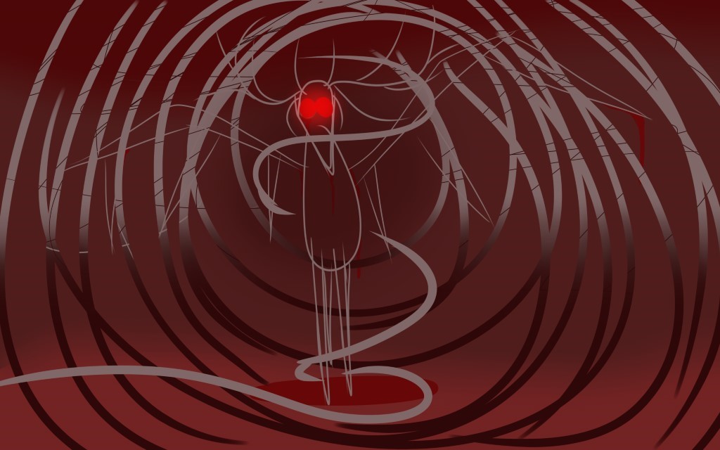
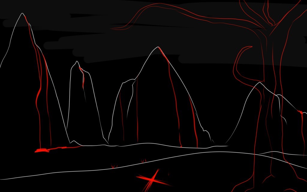
 I chose to do André Breton, I find his work to be odd in the best way possible.  A French writer and poet, His writings include the first Surrealist Manifesto of 1924, with this he defined surrealism as “pure psychic automatism”. He was born 1896 in the beautiful Tinchebray. As an only child, As a medical student, Breton was interested in mental illness; his reading of the works of Sigmund Freud (whom he met in 1921) introduced him to the concept of the unconscious. Influenced by psychiatry and Symbolist poetry, he joined the Dadaists. His inspiration was Tristan Tzara a poet, Tristan Tzara, Tristan Tzara yet anther poet and many more. With his first three inspirations he must have been inspired more by poetry, he was one to write and dabble in poetry along with his art. 

I love how This is such an old piece and yet its so original, it seems like it’s a regular picture of him with a 20th century twist to collage to it. The goofy atmosphere of this piece can define how he sees himself as an artist but yet the stern surrealness sets his work. His use of minimal colors makes this appealing to the eye as its not too in your face. The use of green, red and brownish yellow gives this almost bland piece a pop of color. As I’m struggling to find words to describe this I asked my sister what she though, as shes not much of an art head her words were “it looks like there’s a marshmallow on his head smoking a cigar” and looking into it as a modern perspective it does make sense where she’s coming from. Going into this blind with no knowledge on him or his work it can look odd. 

Music expressionism

The song I listened to while doing this was Alpha by c418. As it’s a Minecraft track, I found it very relaxing. The one thing I know is that there needed to be some sort of plants in this, I wanted it to a subtle but there. While listening I conveyed my emotion from the song to my pen. I knew there had to be a person, so I got to work on a side portrait.  I had this on loop while I was doing the whole piece, it’s very slow and flowy, so it’s something I could take my time on, make sure it looked alright and there wasn’t too much stiffness.  Listening to this song made me feel safe and emotional, I knew there was no way this would be a normal portrait, so I made it upside down. Gave her no eyes as who would need eyes with beautiful sound such as this.  

This has come out just how I wanted it to. As this is a digital piece it was very tame so, for my next piece I will be doing a wilder traditional approach with some acrylic paint and pencil work maybe. I haven’t quite decided yet, but I know what I want to do and what music will inspire that. 

 For this next one I listened to Goodbye to a world by Porter Robinson. It’s a very nuclear, and with what the world is going through now it’s fitting. It’s a song that has robotic like vocals that sums up the future of technology. I tried to do rough and quick marks and not spend too long on each part as it was a quick chaotic song that I personally connect to a chaotic end of the world with people screaming and panicking with the other half just knowing it’s the end and nothing can happen.  

My third piece I listened to IC3PEAK Плак-Плак (Boo-Hoo).  The colour theme of the video inspired me to have the same colors. The feel and undertone of the song made me want to do something quick without really sketching it, something menacing but very clear and almost blending into  

 Spirals, similar to what the song is about, blending in- so, that’s what I did. 

Nowhere to run ; Stegosaurus rex. A waste land with nothing but bloodthirst…  

This is my second piece with mostly black and red with white. These colours contrast well wioth how I feel when listening to to music. 

While doing this task I misunderstood the task at first as I watched the videos and saw they were drawing whatever came to their mind and for me, I drew what came to mind roughly in the time of the video length. The first one I had on repeat to really feel the emotions of the song and started to draw what comes to mind. I don’t do well drawing what I’m feeling with patterns, I most likely have to draw whatever I think off, may that be an animal or  a human, yet even a place, I need to draw it, sketch it and see what im doing, that’s where I get most of my emotions and ideas from, just listening to one genera of music while sketching and lining. 

Susanna Phillips

Susanna Phillips (née Burney) 

This image to me makes me believe she’s a rich woman, someone with power but has a tender heart. She’s dressed very softly; her clothing is white that give me the sense of purity. the yellow and blue on her clothing, the yellow is supposed to mean the concertation and does not get distracted, the blue is someone loyal, witty and sarcastic. The colours could have little meaning but as this was painted in 1927 it would have to have meant something. 

To me, this is a very beautiful piece, something that I can’t draw my eyes away from. The background is seemed to be set on the outskirt of a woodland area, perhaps a cottage manor, I can tell this from the background, there seems to be a dark green in the background that’s allowing us to peek behind to the outside. The sun is either setting or rising, as there is gold like on the background i can assume it from the sun rise. 

Pablo Picasso

Pablo Picasso  

Libby Forbes 

Name of work: Responding to war 

Year created: 1941 

Medium used: Oil paint 

To me this piece caught my attention as I find it quite rare to find something that represents war in the way this painting does. To me after reading the description already on what it’s about, the thought of war comes to mind in a different way, almost as if a it was a savage time in history. The dogs represent the soldiers at their prime time, no weapons just defending what they had, even if it wasn’t a lot. It communicated every man for himself situation. Theres not a pack it’s just two dogs seemingly defending scraps of food from whatever may be threatening them. 

The one thing I really liked about this was that Picasso didn’t want to go out and take pictures of the brutality like what most artists do, instead he interpreted war in his own mind . I personally find this piece to stand out more than any other war piece. All the others if you simply type into google come up with images of very detailed scenes of death and destruction, or even for that many 

 revolutions. However, without context this would simply look like 2 dogs that are angry, its far more than that.  

The colors seem to be sinister. The use of black and red are the main colors that correspond to darkness and blood / violence. The shading used is a nice simple way of shading, this is the same type of shading when I want to draw a piece that can get a message across without getting distracted. As this was painted during WW2, he wasn’t looking for something to depict like a photographer. I am assuming that from what he has heard and possibly even experienced he knows that war is something that changed people. We all know dogs for being fluffy and loving, rather friendly, I like how he made them the opposite in this case. May that be on purpose it still gave a message. Sure you might not think of it as war when you see it, but you think of some violence, there’s some killing going on, or the bones wouldn’t be there, there would be no reason for them to be there unless he was fixated on painting the war in a natural way to the wild nature of the animal. The line on this piece is very thin, it’s more of a fine painted piece, there’s no brush stroked to really indicate how he would have painted this, may it been taken his time on it or actually was fast and rough with it. For me I can’t see any brush strokes, so this tells me that he did spend a lot of time on this, as it did represent something with a heavy heart at the time. 

Dada

Dada & anti-war protest art 

Dada artists felt the war called into question every aspect of a society capable of starting and then prolonging it – including its art. Their aim was to destroy traditional values in art and to create a new art to replace the old. As the artist Hans Arp later wrote:Revolted by the butchery of the 1914 World War, we in Zurich devoted ourselves to the arts. While the guns rumbled in the distance, we sang, painted, made collages and wrote poems with all our might. In addition to being anti-war, dada was also anti-bourgeois and had political affinities with the radical left.The founder of dada was a writer, Hugo Ball. In 1916 he started a satirical night-club in Zurich, the Cabaret Voltaire, and a magazine which, wrote Ball, ‘will bear the name ”Dada”. Dada, Dada, Dada, Dada.’ This was the first of many dada publications. Dada became an international movement and eventually formed the basis of surrealism in Paris after the war. Leading artists associated with it include Arp, Marcel DuchampFrancis Picabia and Kurt Schwitters. Duchamp’s questioning of the fundamentals of Western art had a profound subsequent influence. 

Source: https://www.tate.org.uk/art/art-terms/d/dada#:~:text=Dada%20was%20an%20art%20movement,satirical%20and%20nonsensical%20in%20nature  

In this image, there’s a lot going on and yet these are all things that have happened in time. Theres people tied up and on the floor being treated horribly. Theres some racial tension here. We can see men in the middle making some kind of deal from one  side to the other. art movement of the European avant-garde in the early 20th century. An artist speaking up about troubles of his time. Their aim was to destroy traditional values in art and to create a new art to replace the old. (tate) 

He used a variety of scultpure, collage, sound poetry, cut-up writing, and sculpture. They were also experimental, provocatively re-imagining what art and art making could be. Using unorthodox materials and chance-based procedures, they infused their work with spontaneity and irreverence. Wielding scissors and glue, Dada artists innovated with collage and photomontage. Source: https://www.moma.org/learn/moma_learning/themes/dada/  

To me this image is a deal between men of different sides, wanting what the other has. Violence in exchange for “protection” and food/supply’s, and in exchange they can have the citizens of that country to use as slaves. War, food, death and deals. This is a lot to break down as there’s so much to reveal. To me this is a chaotic, and I really think this is what they were going for, for a message of chaos while looking chaotic and can make the mind overwhelmed and confused. 

1000 word essay

François Boucher 
1755 

Oil on canvas 

France  

The Four Seasons: Autmn 

21 3/8 x 28 5/8 in. (54.3 x 72.7 cm) 

This is a piece of a young woman and a young man, bodies shown fully agents a light washed background with natural tones. We can see she has a basket of fruits as well as the young man clasping some in her lap in the center. The woman’s dress is a cream color, quite natural while the man wears orange and blue showing a burst of color. They seem to be on the outskirts of a woodland area on a nice spring afternoon. The trees on the right seem to be almost curved over almost caving them in for “privacy”, the body language is very loose almost like a romantic tension almost like the man is trying to woo her with flowers that we can see in just above the grapes/fruits in her lap that can suggest a romantic gesture. This could also be the reason of the flowers. Theres any options to suggest they were together the whole time or if he had met up and found her in the forest. Who knows, they could have known each other for some time or had just met in the woods that day and been stunned by her beauty. 

The line in this piece is very fine, it’s clear enough for us to see where it ends and where it’s from in the piece. The line is evidently clearer on the trees and some rocks on the ground.  Theres little line to be seen.  The colors here are quite natural colors, the only bright colors that stand out are the man’s waist coat and trousers. Orange and navy blue, it’s to be noted that he too does have a hat, it can be seen on the floor closer to the foreground, a beige hat with a navy-blue ribbon. This to me shows that he has a softer side, a more poetic and hopeless romantic.  in the whole image there isn’t an awful lot of space, its more focused on the two people in the piece. The space there is left is filled up with rocks, grass and tree stumps, in the background the sky is a very washed blue with white clouds that take up the blue and make it all faded and not too vibrant. Theres a very exposed area in the background but it would have been ruined if anything else was put there, there’s already the tree leaves on the right arch over. The lighting is quite soft in my opinion, there’s not an override of it. The light on the dress make it give texture along with all the clothing. The tree has a silk like sight to it, the tree looks smooth to the touch. The whole piece looks smooth, yet you know the texture on how it would feel if you were to look at it, if it were rough, smooth, sharp. Its lighter in the center where our two people are as if to put the spotlight on and say, “I’m here, look at me”.  The shape is a lot more curved, how it was shaped it’s been blended almost like it’s a tree there aren’t any sharp edges, it’s all very pristine and they have character to them, looking rough but smoothed down rough. 

For me that I can see if no sketchy elements. It’s all done very soft, curved lines almost. The curved lines here for me made this piece look so much softer than it should be, given the sense of something being there. I can see two lines of sight, one where the man and lady are, and once slightly behind them, that’s where the trees end in our field of view. The curved lines at the very front that mold the painting very subtly. The colors used are very harmonious, I would say the only bright colors here are the man’s clothing. A bright spark of orange and blue clash almost disturbing the painting. This tells me he’s very immature, a womanizer that doesn’t love. Although that does go agent what I mentioned about him being love stricken, it could be that this is the one woman he fell for. The intensity of his clothing isn’t so major that it blinds us and gets the viewer to think it doesn’t belong there, it’s just enough to spot and see that it doesn’t really belong there. Compared to the woman’s light clothing, it makes us think that she’s pure, never loved and is naive about his presence, is perhaps why she can sit there so calmly. The background is all the same color just different values and intensity. The theme is spot on, there’s a soft sky with a baby blue mixed with grey white to make it not so intense. The tree branches aren’t brown like you’d expect them to be, they’re mixed in with the lushes’ grass with only minimal accents of a lighter green to show where the light is positioned. 

The space used in this piece is well used. It’s not too big that there would be massive obvious blank spaces. The artist has seemed to make it enough to fit the characters as well as the background could have some space to build so we can see the bigger picture on where it is where its set etc. I especially really like how they made the sky not too big or that would have left out a lot of empty space that couldn’t really be filled. The overall light is very cool, there’s not any harsh light that really ruins it, it all fits the theme of this piece well. The shape for the main subject is like a triangle, it fits them both in the center and shows the focus of the work.  Theres very few straight lines in here, I would say the only straight line are the trees, otherwise it’s all more curved with a natural undertone. The shapes are very hidden here, there’s parts where you can see shapes like on her dress and the man’s hat as well as the trees, otherwise to me it’s not obvious.