Triangle lateral thinking

I wasn’t so sure how to go about this so I just went in the deep end and tried to recreate the classical dress blowing up as well as a simple mountain landscape drawing ( this is my faviroute by far ). I could have added colour but with the time crunch i wont have time, regardless i think it looks good the way it is in pencil and nothing else. It was very nice working with simplistic shapes in order to create a nice looking piece, and yes these are very basic but I like how basic these are, it brings out more detail and can get you a lot more lost into the image by trying to figure out what’s going, what’ll happen and why.

Evaluation

When starting these projects, I was so behind it was just not making me want to do any of the work. I honestly cannot remember a lot from the first project I have done as my old art book is at home. However, the final piece of my first project was about sexual assault that happen to men, this was something that needed to be spoken about, so I did take this one very seriously and try to make the final piece as realistically (in the concept not art) as possible. It was very satisfying seeing the result and the message got across. I would say I enjoyed the practical parts the most, well I say that it was only the drawing part of it that I enjoyed, regardless of being good or not. I will say from project 1 to 2 has really helped me be messy, even messier than I would try to be, that things out of proportion can look good with some detail and time.  

Time management has ALWAYS been something Ive struggled with. while being present in college it was easier to get work done, however ever since coming back it has been a lot harder and therefore making me lose motivation and not enjoy the project, and this is something that crushes me because I do really enjoy the subject and drawing. Losing my passion for what I love to do the most is the greatest horror show Ive had. I did really start to enjoy the practical of the tin can art, it was a nice setback for me. The research for it really did not go well but I knew what I wanted to do so I stuck to it and worked on it. It was really a wonderful experience and made me enjoy something that was not a drawing practical. Along with enjoying practical is, I absolutely loved the watercolor workshop- felt it was really my time to “shine, even though it was all considerably basic. 

Overall, I feel like this year has really taught me that time is everything, getting things done in time as well managing that time. It’s given me a lot of time to experiment with a lot of things, different materials as well as broaden my Horizon for me, making me want to become better at what I do, take time, don’t be afraid to be messy because sometimes that can look a lot better than being neat. I would be lying if I said it was easy because it really wasn’t, I’m currently catching up on work that Ive missed due to just losing all motivation and not caring what’ll happen. Ive worked so hard to try and get myself back up and I can’t let myself flop again.  

Tin can art update!

I’ve recently finished my tin can art based around my idea from my sketches. I decided to make it more darker than originally thought and it turned out really well. I would have loved to do more but with the rain and everything being dry it wouldn’t have worked well and i feel this works a lot better than over cluttering it.

Upcycling research

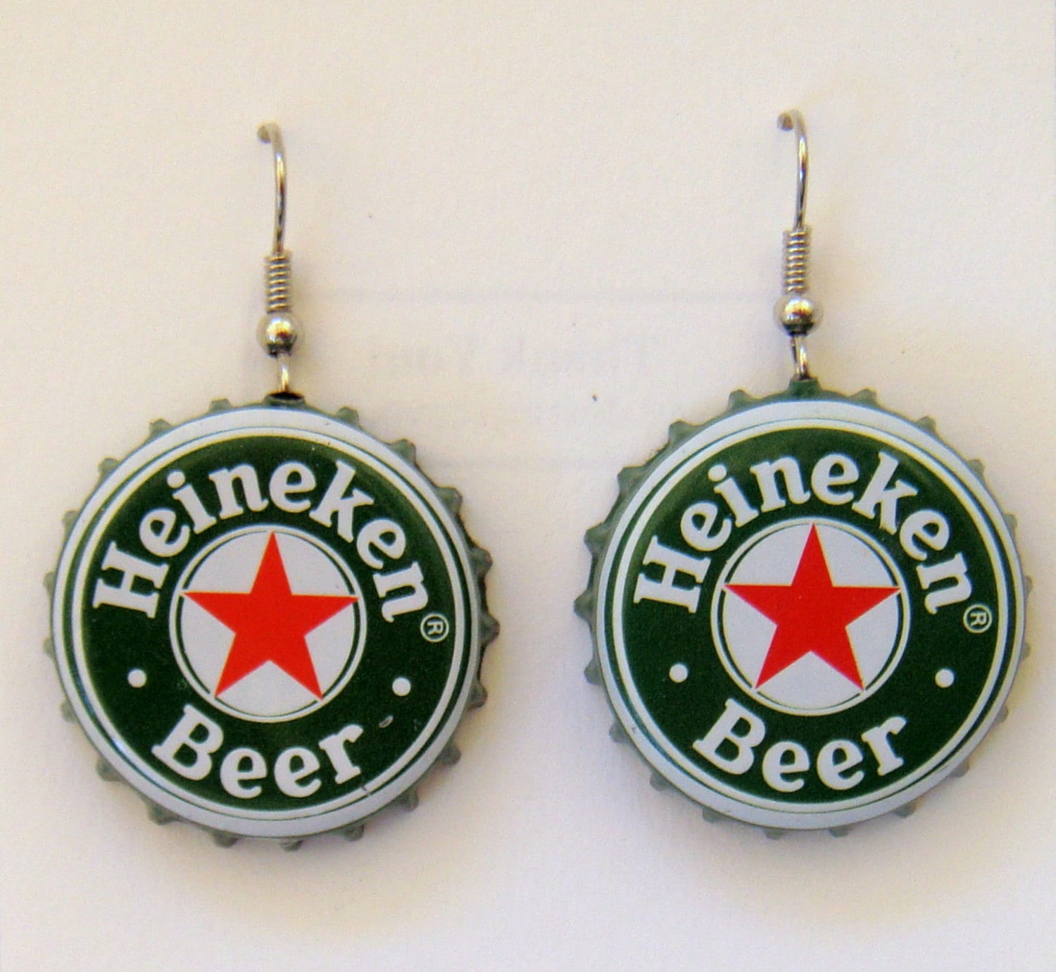
In a simple term Upcycling is re-using your rubbish! Make it a piece of clothing, an accessories- a great example of this is plastic bottle and making it earrings or any jewellery. This is the best example of reusing junk for fashion!

See the source image

There’s many good ideas to help with re using your rubbish, may that be something small such as bottle caps, buttons and tins! using tins as a flower pot or even to grow fruit or vegetables is a very good environmentally friendly way. Glass bottles can be used as candle holders, fairy lights decoration, for people who like to have the odd glass of vodka a night its a very good way to make these tings as well as more. With boxes you can use them and even collect to make into some make shift mini tables.

For Recycling you can use for anything you cant upcycle. Its a lot easier when needing to get rid of waste that isn’t needed and will help you not stock waste that isn’t needed / cant be modified.

Water colour experiments

We done some water colour experiments as well as a piece at the end. I would like to do one more later with salt but that’ll have to be when i get back so I’ll update once ive got it all done as well as the image. For now here are the ones ive already done.

I like how this turned out. I added wayyy too much salt, but then it is yet to dry so i can only wait until its dry to scrape some off. I love how the red and blue contrast kinda.

Vantage points

we have a lesson where we need to take a picture of anywhere in out house and draw it. We had to focus on the main elements, perspective, colour etc. No where is really interesting so I done my room as normal. I just took a picture, went over it and added slight detail. I don’t want it to have too much detail as till look odd considering I only sketched it and not lined. I wanted it to have a night theme as well as the main colour – pink. So, I made it warm and added the pink to try and make it washed. I could have done more to this but considering I procrastinated until 12am its ok n average. I feel overall its good? while free handing some things I still got perspective down and avoided cluttering too much.

Quotes

Today we needed to find some quotes and put it to an image. So, i picked out 3 quotes from my life that I like. In the end I chose ‘Don’t stop drawing’, ‘its all happy little accidents’ and ‘why bother trying to explain love? it should be something you feel not think’. Ive decided to do don’t stop drawing and the explain love one. Ive done one that’s digital and traditional, I actually like both outcomes for once. Although the digital is more edited picture but its still digital. Here is the work that I had done in my book, I still need to print off my digital pieces as well as 3 inspiration things.

And my second piece

I really like both. now looking at it its a little too vibrant for my taste and i could really do with making it less bright and getting the text to be more visible. I feel like making the text black would be too harsh and make the contrast too visible. I still need to print this off and write this quotation into my book, otherwise this blog will hold all of this.

Commercial art Pt.2

I quite liked the clothing commercial art. The best example I had was THRASHER magazine. They took the genius idea to sell a magazine through fashion. This reached out to a lot of young teens, young adults and adults back in 2015-18 and no one even knew it was a magazine brand despite having magazine written underneath. The magazine founder Thrasher is a skateboarding magazine founded in January 1981 by Eric Swenson, and Fausto Vitello, and published by High Speed Productions, Inc. of San Francisco, US. The publication consists primarily of skateboard and music-related articles, photography, interviews and skatepark reviews.

Thrasher in Streetwear Skateboarding also became popular streetwear. Most will argue that it began when influential streetwear giant “Supreme” released their video “Cherry,” which highlighted the skateboard culture to the world. Soon celebrities like Justin Bieber and Rihanna followed. They have been spotted wearing Thrasher merchandise on multiple occasions, which promoted the brand to their fanbase. The cherry video from supreme came out in 2014. This obviously made thrasher want to expand their brand into new territory, straying far from the US all the way round the world due to social influencers, this caused the popular outburst of the thrasher fashion in 2015 in the UK.

Source: Skateboard and Streetwear Culture: The History of Thrasher Clothing · Beautifulfeed

Cherry Supreme video that started it all: https://www.bing.com/videos/search?q=cherry+supreme+video&docid=607987556521870840&mid=F4E248726B5F2F43100BF4E248726B5F2F43100B&view=detail&FORM=VIRE

My second option Visual Communication.

I really like how the ‘We can do it’ quote empowered women through the war and gave them a reason to get up and do something-

And yes from one of the most unreliable sources Wikipedia- ” We Can Do It! ” is an American World War II wartime poster produced by J. Howard Miller in 1943 for Westinghouse Electric as an inspirational image to boost female worker morale. The poster was little seen during World War II. It was rediscovered in the early 1980s and widely reproduced in many forms, often called “We Can Do It!” I absolutely love how They gave the women power and the power to support the men in the war. Compared to now, the only quick quote that i can think of from a brand to try and encourage you to do something is Nike with the ‘just do it’ It might be because of how long its been but it just doesn’t feel special to many people. Its not in a time of need, 2020, we’ve barely heard it- possibly have but I really don’t take note on Nike media that much.

Packaging

Packaging is my final one, I do like how companies design a good logo and something that stands out and when people see it more often in stores, someone’s hand or on the floor you’re more than likely to try it for yourself. The BEST example of this is McDonalds. Everyone knows it so well, you’re bought up and already know it. 15 May 1940, Richard and Maurice McDonald, The people behind this American treat, it grew and struck world wide, and not to this day, we don’t need an introduction to the Donald brothers when their fast food restraunt is literally their name.

Line drawing task

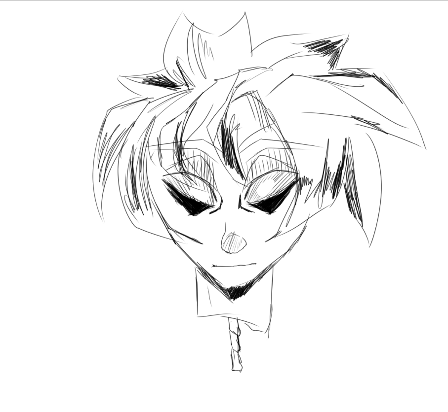
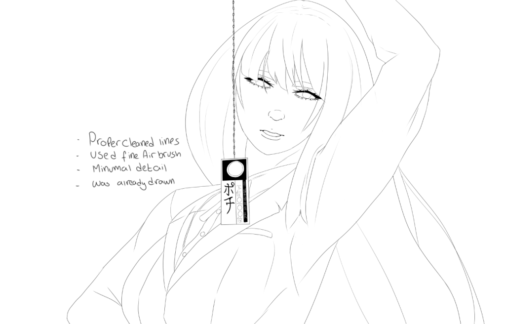
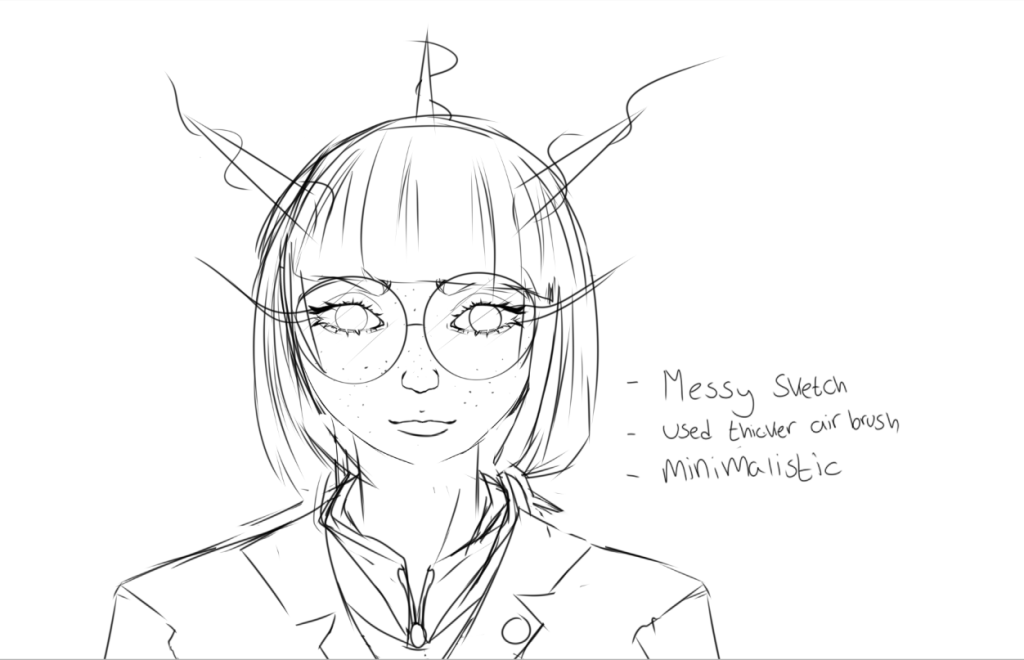
We had a line drawing task today to draw 4 pieces of art of anything from what I understood. so I got to it throughout the day. I for one i used a piece that was already complete to show actual line art, the others I sketched through the day when inspiration struck. some took more time than others but it is what it is.

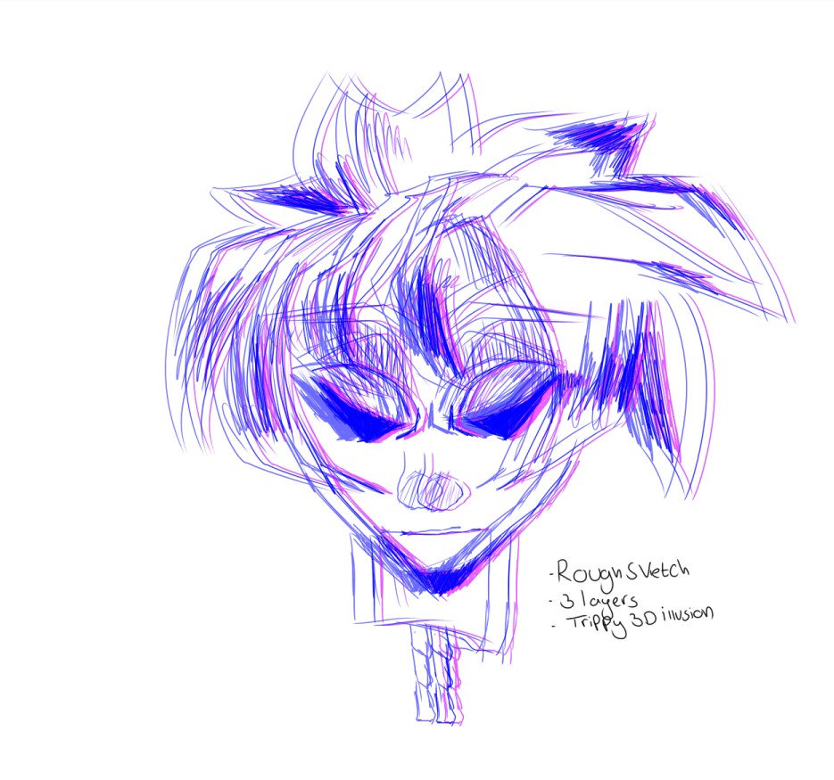
These are the first two I managed to do. I wanted to go for a really rough looking manga style of art, something i would and wouldn’t usually do, for this I took no care at all and went for it. I do like how they both came out, Obviously its the exact same apart from the 3D looking affect on the second one just to make it a little more different. I like how I was rough for the first time this year with some art, not caring how it turned out and it actually worked out alright for the task given.

This is the one that was previously done, I simply just had to remove everything so it would be just the line art. As an already finished recent piece i do say this is one of my faviroute because of how long it took while doing it. This gives a very simplistic line art style compared to all my others, its a lot more tame and less detailed than you’d expect for a final line.

My third sketch was one I had previously done but can fit into what we are doing for today. Its rough and sketchy but not sketchy to the point that its so messy to even see, I would say this is a finalized sketch and fits well with what i have previously done already in comparison to the others.

My final one was a quick sketch combination with two floral decorations in my room. This was in my old sketch book before, but ive decided to make it more rough and dull looking. This one has the thickest lines and the most depth out of them all as they’re all very fine lined in my opinion. If I wanted it to be more sketchy it would have looked a lot more defined.